One of my jobs as the editor is to create a title sequence for our film. Titles of films typically start either right at the beginning of the movie or right after the opening sequence. Hannah and I decided to have ours appear after our opening sequence, which means it will appear last after the first two minutes. We decided to do this to let the audience absorb what they were seeing so that they could infer the setting, what is going on, the character, the problem, etc. Letting the tension build up before the title will give it more significance, and the audience will know the basic key components of the film after the opening scenes which they will then associate with the title.
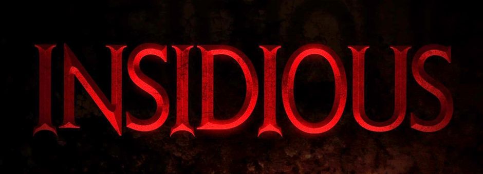
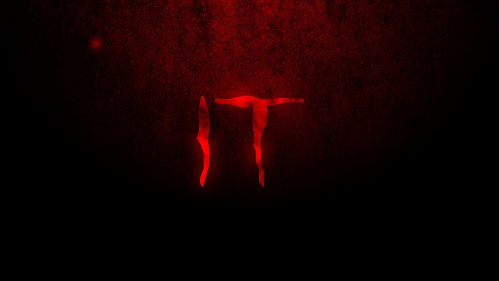
Titles within the horror genre tend to be pretty universally similar. Lots of them have big bold letters in scary fonts to correlate with the horror theme. Hannah and I knew what we wanted from the start, so creating the title was a pretty easy task. We referred to a few different horror movie titles that had big red lettering in creepy fonts:
To get our font, I searched up on google “Horror Movie Fonts” and I went to the website https://www.dafont.com/ and chose the one we both liked the best:

We chose the font above, titled “stranger creature”. I simply downloaded the font, and copied and pasted each letter of our title into iMovie. I changed the color of the font to a deep / bold red color, since red resembles blood and all things scary. I increased the font to a large size to make a strong statement. Below is a sped-up screen recording of me creating the title.
